![]()
TOYSR Wedding
![]()
TOYSR Wedding
When you walk into a designer boutique, it’s easy to fall in love with a fabric because of how it looks in the mirror. However, what looks stunning to the naked eye under showroom lights might look completely different through a professional camera lens. Choosing the right wedding outfit colours for photography is an art that balances skin tones, venue lighting, and the overall mood of your celebration.
At TOYSR, we’ve seen how a simple colour choice can either make a bride “pop” against her backdrop or blend into the mandap decor. To help you make the best decision for your 2026 wedding, we’ve put together this comprehensive guide on colour theory and photography.
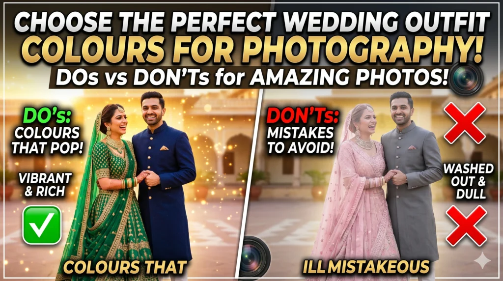
For generations, red has been the go-to for Indian brides. From a photography perspective, deep reds and maroons are incredibly “reliable.” These tones provide a natural warmth to the skin and create a high-contrast look that stands out in almost any setting.
Modern 2026 weddings are leaning heavily into the “Quiet Luxury” aesthetic. This means soft, muted tones like Sage Green, Dusty Rose, and Peach Fuzz (the timeless favourite) are taking centre stage.
Your wedding outfit colours for photography should never be chosen in a vacuum. You must consider where you are getting married.
In the bright sun of Kolkata, colours appear more vibrant. If you’re at a location like Princep Ghat or a garden, Lavender, Mint Green, or Sky Blue look ethereal. Avoid neon shades, as they can “bleed” colour onto your skin in photos (a phenomenon called colour casting).
Evening receptions are usually lit with warm yellow or “mood” lighting. This is where Jewel Tones shine. Think Emerald Green, Midnight Blue, or deep Plum. These colours hold their depth even when we use off-camera flash to capture the party energy.
One of the most common mistakes is for the bride and groom to wear the same colour. To the camera, this creates a “solid block” of colour with no definition between the two subjects. Instead, use Complementary Colors:
| Wedding Event | Recommended Colour | Why It Photographs Well |
| Haldi | Mustard or Burnt Orange | Contrasts beautifully with yellow turmeric. |
| Mehendi | Teal or Lime Green | Stands out against the green henna and floral decor. |
| Sangeet | Royal Blue or Metallic Silver | Reflects stage lights and adds “shimmer” to motion shots. |
| Wedding | Classic Red or Sage Green | Timeless and provides high contrast against the Mandap. |
Before you finalise your outfit, ask your decorator for the colour of the Mandap drapes. If the Mandap is decorated with red roses and you are wearing a red lehenga, you will effectively disappear into the background. Always aim for at least two shades of difference or a completely contrasting colour to ensure you remain the “main character” of your wedding album.
A new trend we are seeing for 2026 is the all-white or ivory wedding. While this sounds risky, it photographs beautifully if there is texture. Lace, 3D floral embroidery, and pearl work create shadows. These shadows are what the camera sees as “detail.” Without texture, an all-white outfit can look like a flat white blur in photos.
Your wedding photos are a legacy. While trends come and go, the way a colour interacts with light remains constant. When choosing your wedding outfit colours for photography, always think about the “vibe” of the final album. Do you want it to feel moody and royal, or light and airy?
Leave a Reply